Design
Sony NEX-3 review – Design
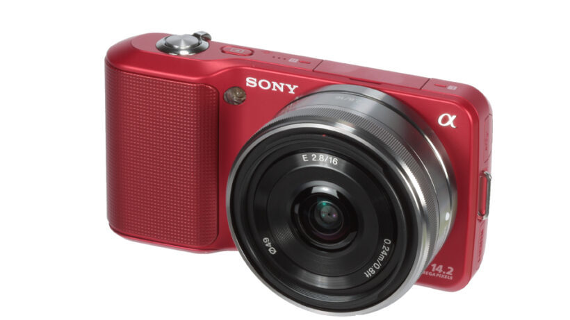
The NEX-3’s design is likely to divide opinion: It appears very compact-like at first glance, but this entirely depends on which lens you have attached to the front. Anything more than the 16mm f/2.8 and the balance between lens and body feels overly front-heavy, especially considering the lightweight polycarbonate finish. The lenses are big too – the optics need to make an image circle large enough to cover that large APS-C sized sensor and, with many offering a wide aperture too, the physical size simply can’t be skimped on.

Compared to the NEX-5, the NEX-3 loses much of the right hand grip which, again considering the weight and size of the lenses, makes holding it a little bit tricky at times.
It’s not just the physical design which has issues either – the menu system, while successfully simplified for ease of use in most situations, does bury many of the options that would be nice to quickly access instead. ISO sensitivity, for example, takes a whole series of button presses and wheel rotations to successfully adjust between one shot and another.
A flash unit is also included in the box, which attaches using a unique fitting on top of the camera. It’s a fiddly process to screw it in and takes far too long – a shame that Sony didn’t opt for a hotshoe-type fitting for greater ease of use. The flash itself is fairly mild in terms of brightness too, though has its uses for fill flash.
Score
Score in detail
-
Features 95
-
Image Quality 95
-
Design 80
-
Performance 90
-
Value 90