
Photoshop: Autumn Images: Page 3
Creating Printable Colour
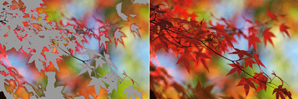
It is easy to assume that the best way to ensure the colours of autumn shine through your pictures is to grab the Saturation slider, in the Hue/Saturation control, and drag it all the way to the right. This is quick and easy but you may get a few surprises when you come to print, as the vibrant hues you see on screen, print out as flat poster-colours lacking the rich details of the original photo (see pic right, where the gamut warning highlights problem areas). Here are some ways to ensure that you retain the colour details in your images.
STEP 1
For those who prefer to capture in Raw mode, retaining details starts in the conversion process. Before adjusting the colours in your photo make sure that the Preview option, at the top of the dialogue, is selected. Next, click onto the black and white clipping warnings (top right and left of the histogram in the latest version of ACR – Adobe Camera Raw). Now when you use the tone and colour sliders to enhance your image you will be able to preview any clipping that occurs. Red or blue areas appearing in your photo indicate that detail is being lost so you should adjust the slider settings until they disappear.
STEP 2
Once the file has been converted, and passed to Photoshop for further enhancement, you can still ensure that any colour changes are not causing printable details to disappear by soft-proofing the photo with the colour characteristics of your printer. The technique requires several steps; start by selecting View > Proof Setup > Custom and then choose your printer’s profile – and maybe media as well – from the menu. Your photo is now being simulated on screen as it will be printed.
STEP 3
Now return to the View menu and select the Gamut Warning option. This feature previews the areas of the colours that are outside of the printable range (the gamut), displaying them as a grey mask. It is an indication that unless rectified, these areas will be printed as flat colours with no details. The amount of grey previewed in the photo will depend on the range of colours that can be printed by your printer/paper combination and how saturated the colours are in the photo itself.
STEP 4
To alter the colour in the photo to suit your printer, make sure that the Gamut preview is still active and then add a new Hue/Saturation Adjustment layer. Dragging the Saturation slider to the left will reduce the out-of-gamut problems but will also reduce the strength of colours that are within gamut, so select the range of colours from the Edit menu that are most affected – here, it is the reds. Reduce the saturation of the reds, adjusting the colour range if needed using the sliders at the bottom of the dialogue until they are more within the gamut.
STEP 5
When it comes to print, there are some more adjustments that need to be made. Firstly, the same print profile used for soft-proofing needs to be selected in the print dialogue. Next, the Rendering Intent should be set to Perceptual or Relative Colorimetric. Perceptual aims to recreate the visual appearance of the original photo while manipulating any colours that still remain out-of-gamut into the range that can be output by the printer. Relative Colorimetric also a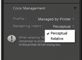 ccounts for out-of-gamut colours but with less adjustment of hues that are within the gamut to begin with.
Lightroom
Lightroom has the same clipping warnings in the Histogram (in the Develop module), and can adjust the rendering intent used for output in the Print module. Elements also has clipping warning options via ACR and rendering intent settings in the Print dialogue. But neither Lightroom nor Elements has a gamut warning feature like Photoshop’s.